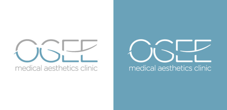
This new Subiaco-based medical aesthetics clinic based its name on the Ogee mathematical curve, or Ogee curve of youth.
Wanting branding that would stand out and move away from the norm for this genre, the logo was created using calming and delicate colours and incorporating the Ogee curve.
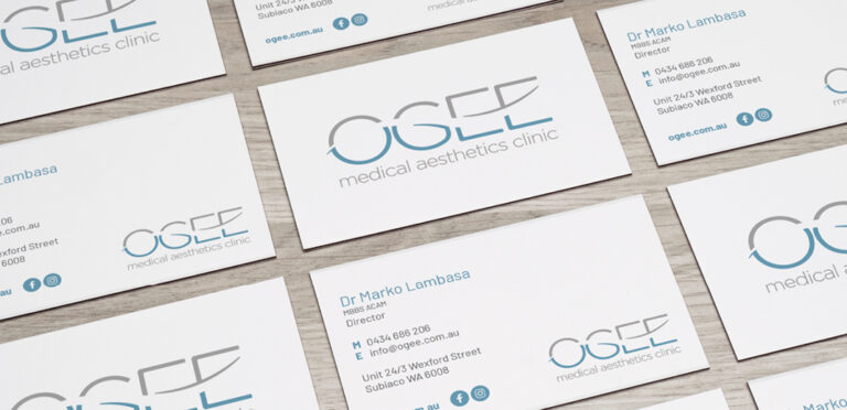
The business cards were created with silver foil embellishment and a rounded corner to enhance the elegance and grace of their services.
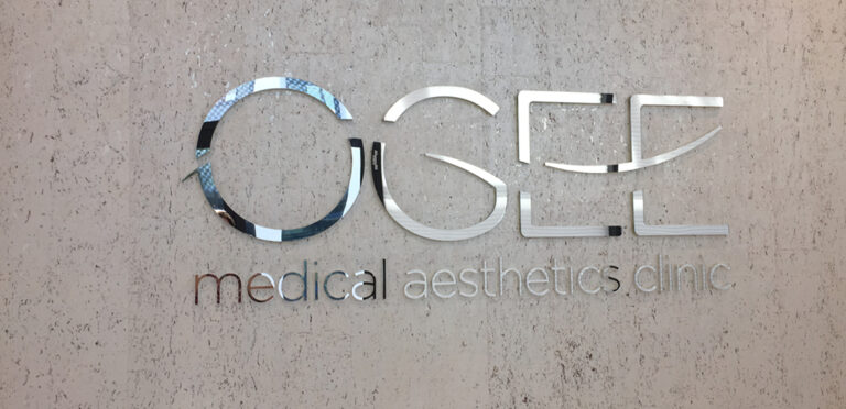
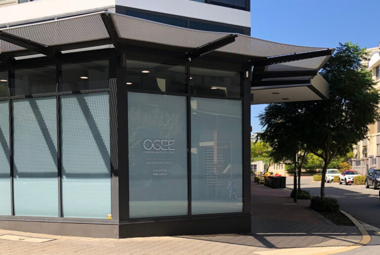
Signage included frosting to exterior windows and the OGEE lettering in silver mirror acrylic polished and installed direct to their reception wall.
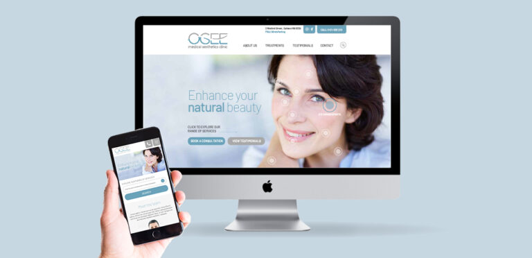
The website incorporates the use of navigational hot spots as a filter system to convey all the information required within an aesthetically pleasing environment.